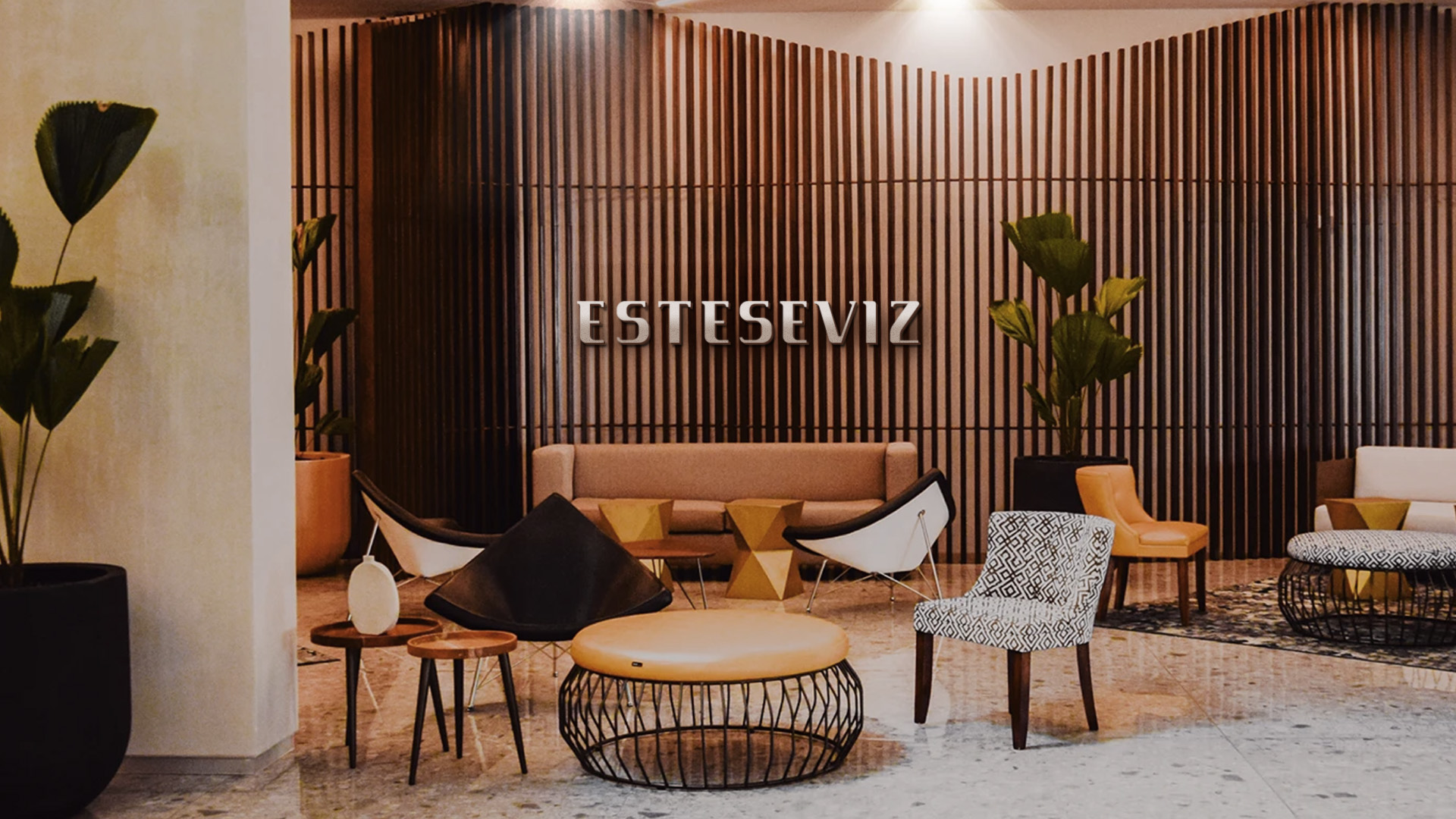
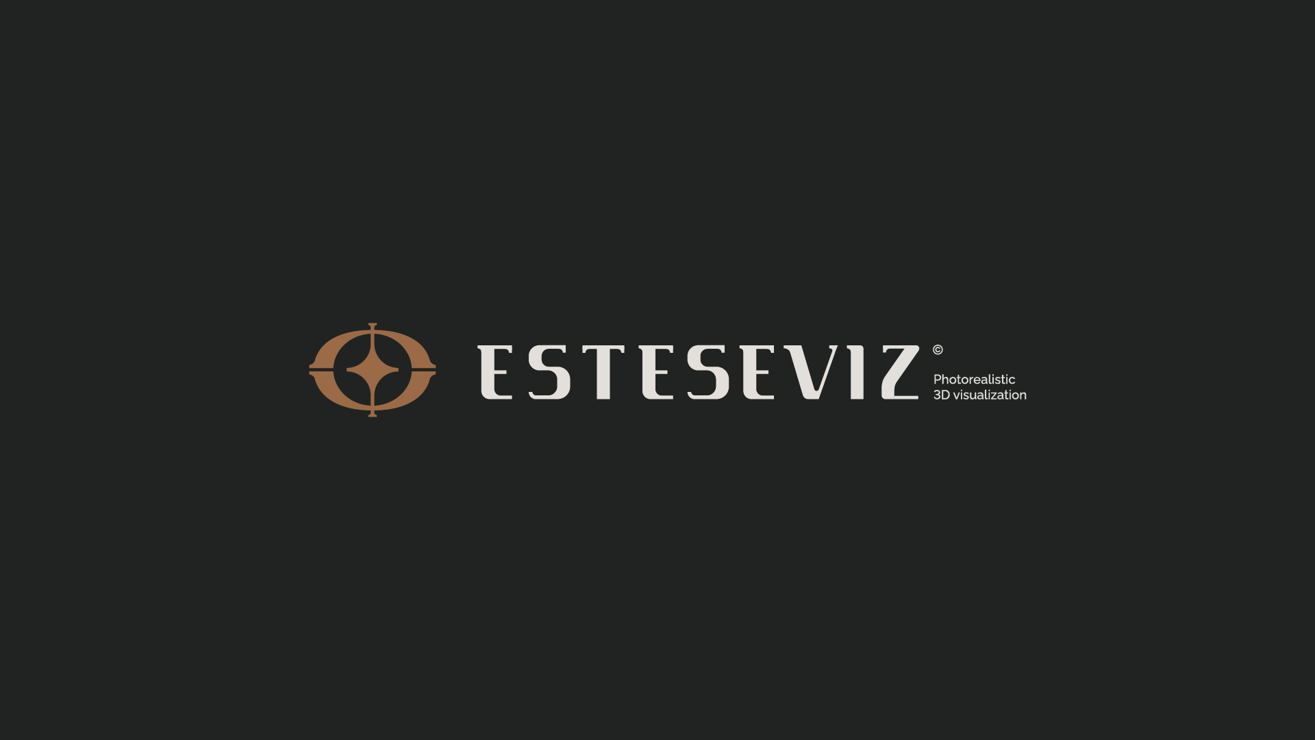
ESTESEVIZ Photorealistic 3D
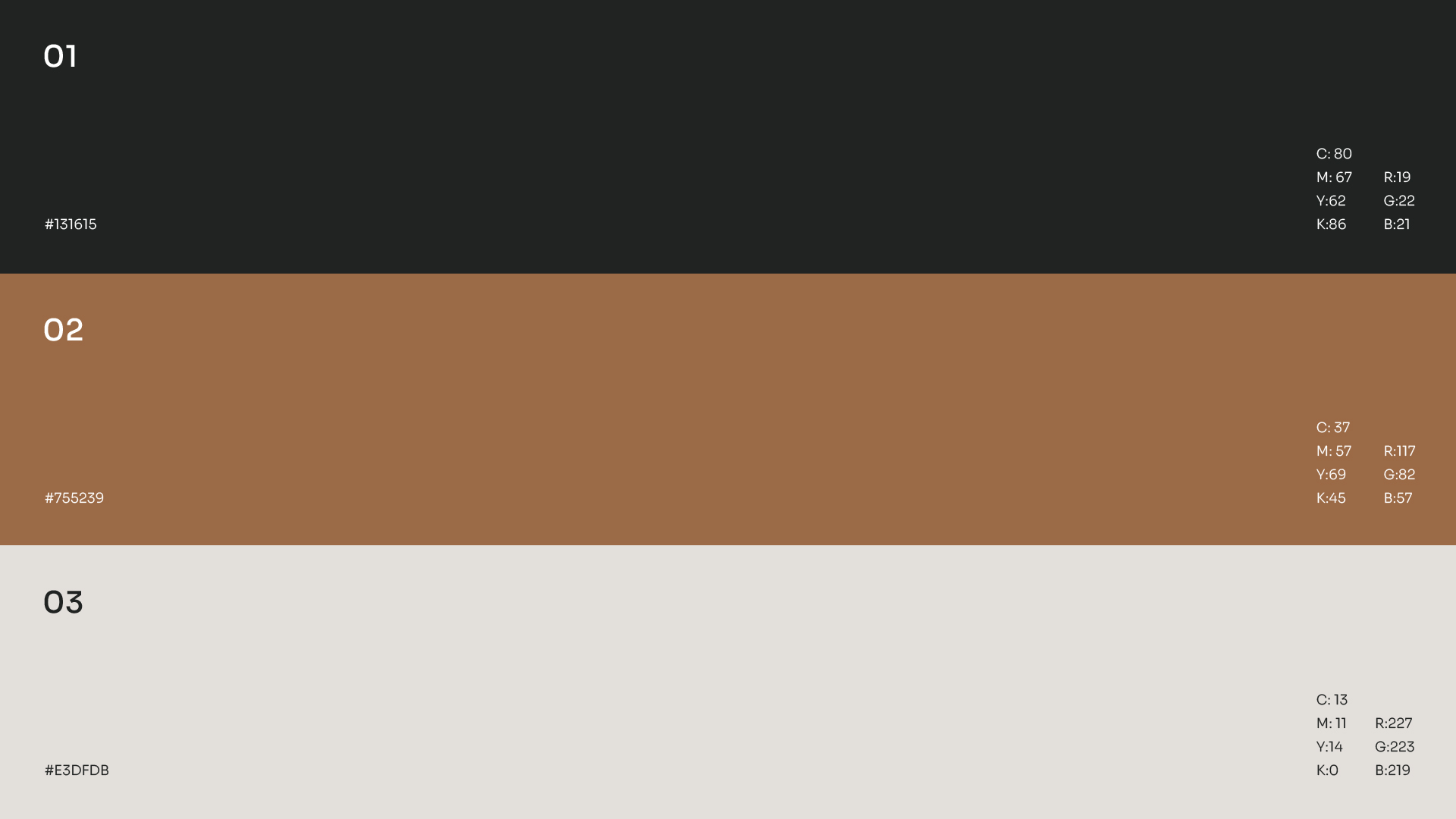
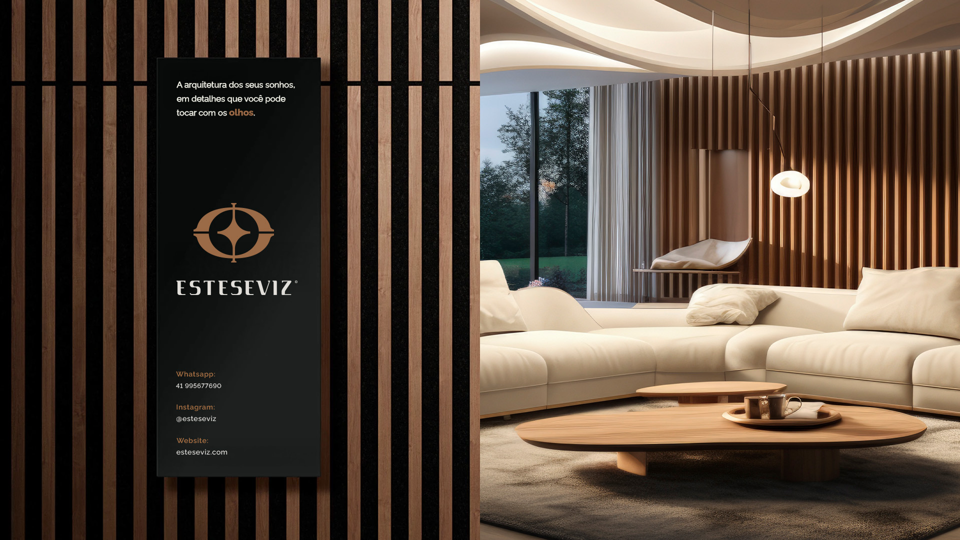
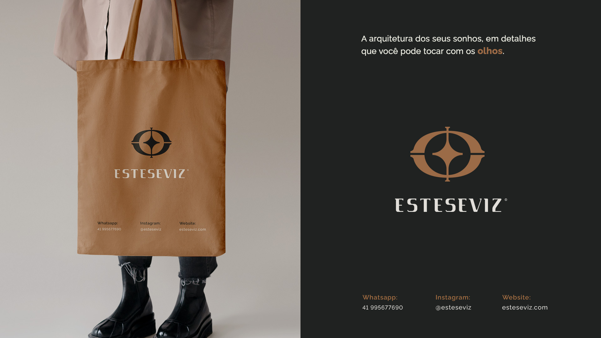
The name Esteseviz comes from the Greek aisthesis, the capacity for sensory perception and the way we experience the world through our senses, a word that carries within it aesthetic emotion, sensory experience and admiration for beauty. With that meaning as the starting point, the identity needed to match, being deep, sophisticated and full of intention.
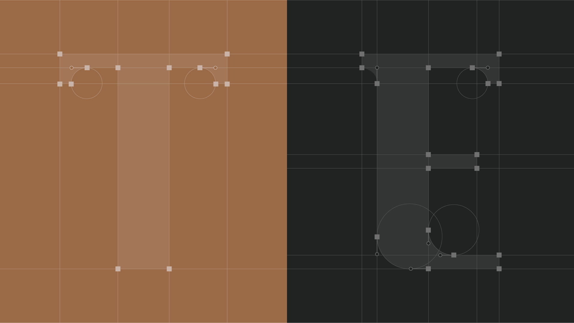
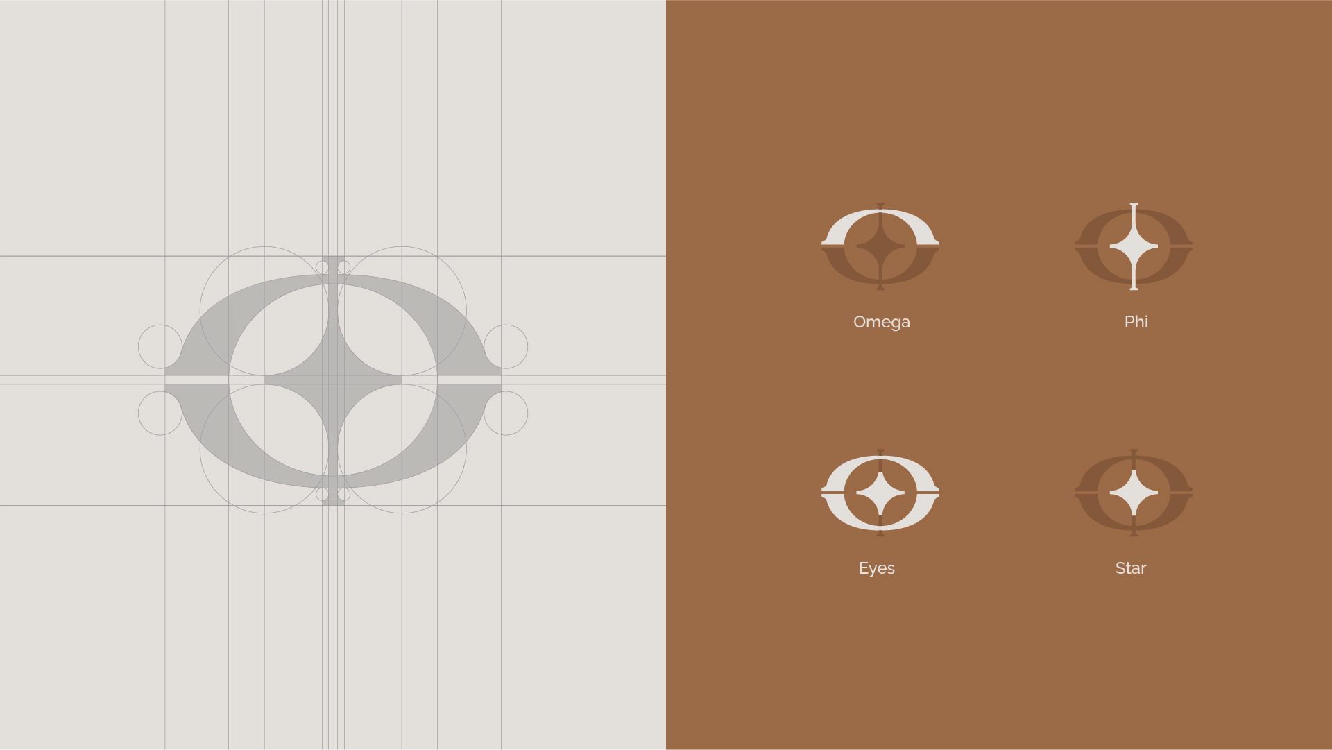
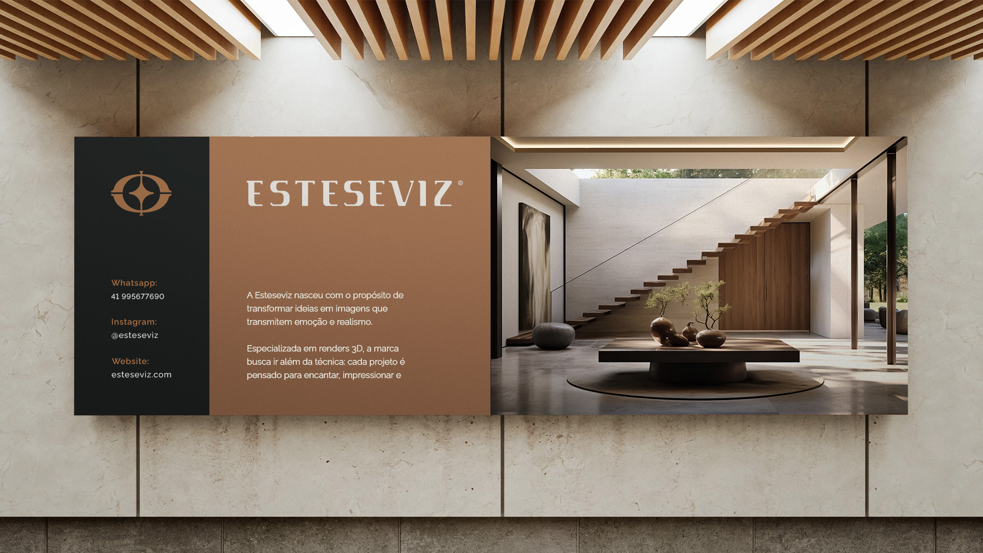
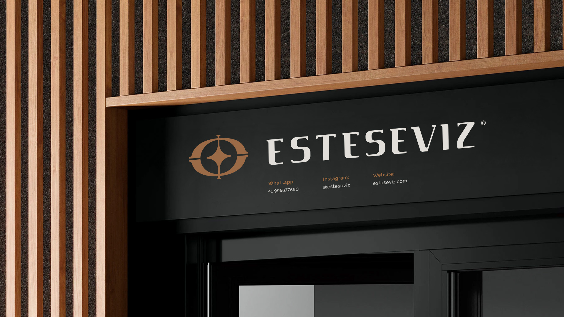
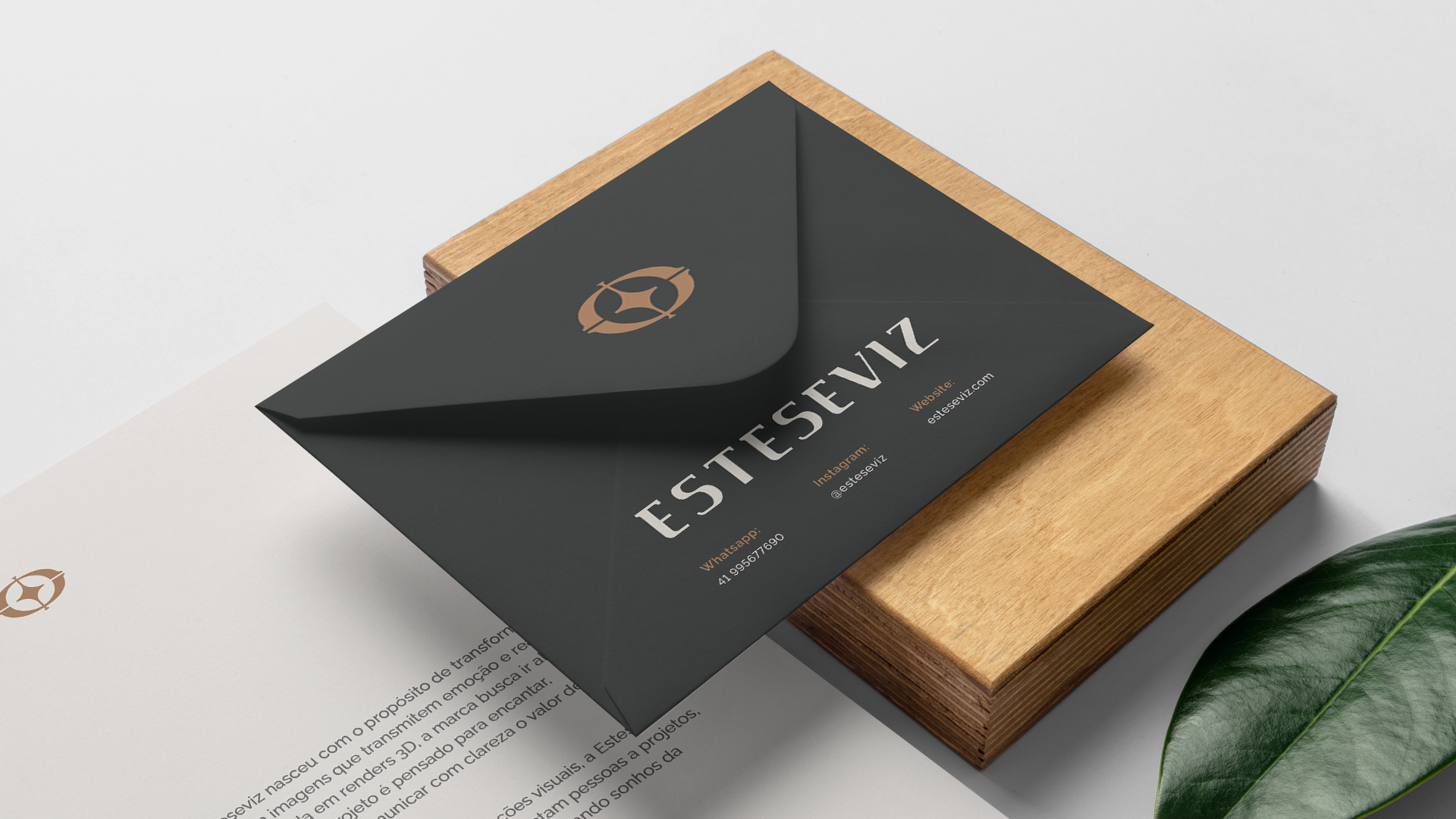
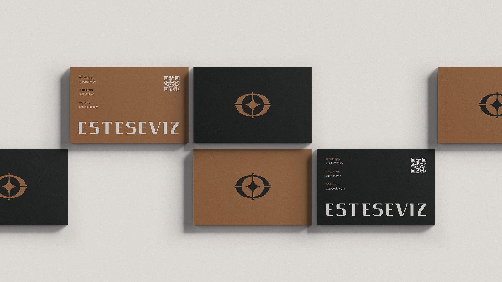
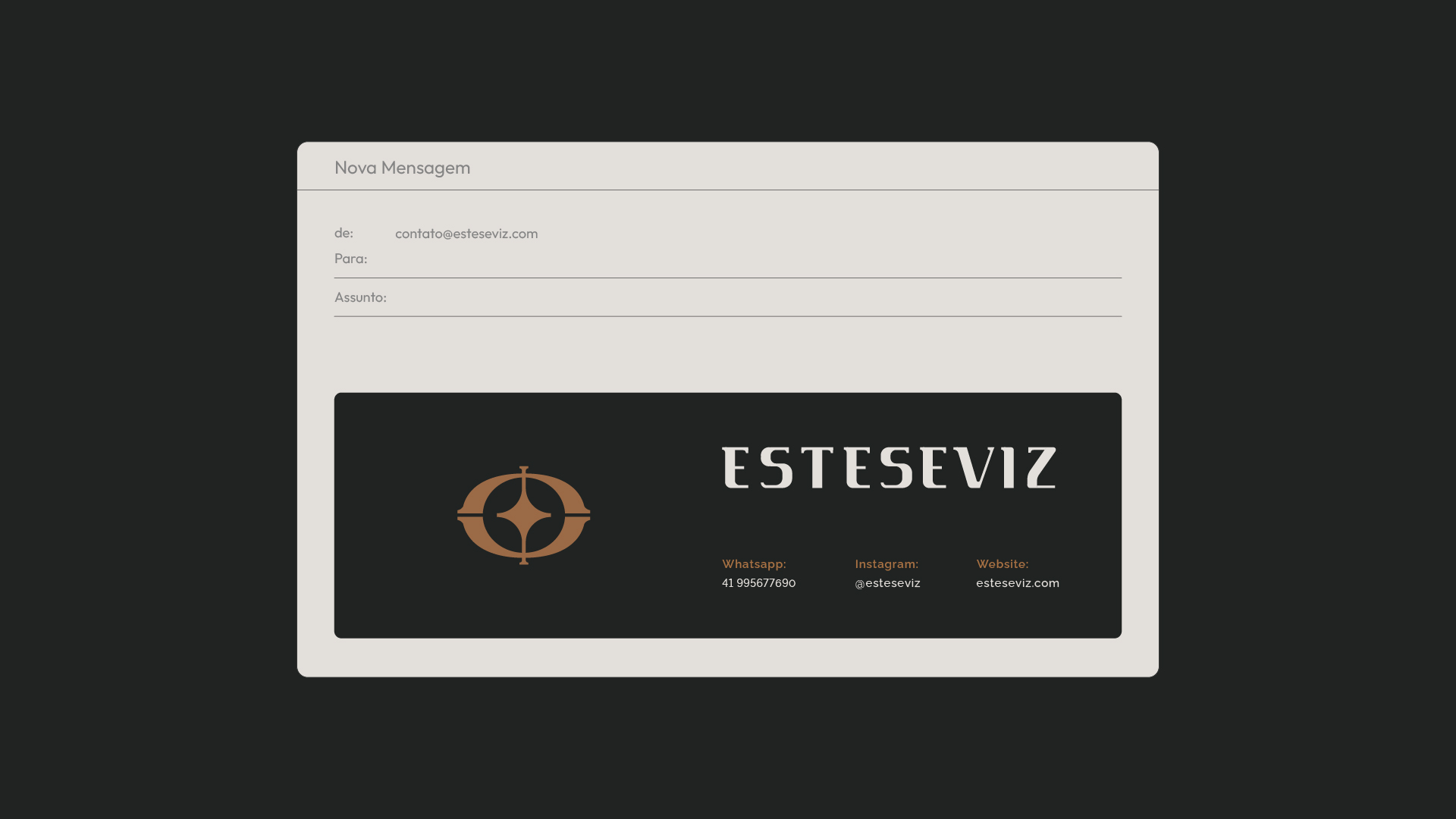
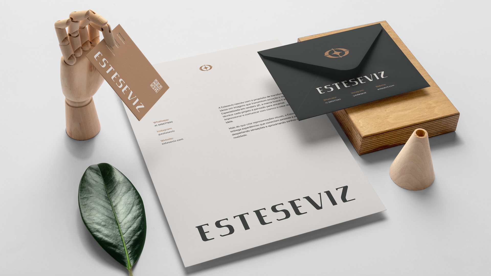
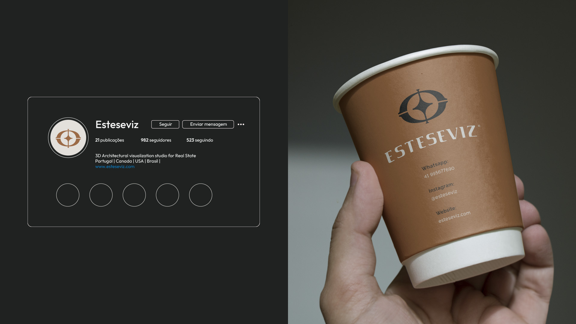
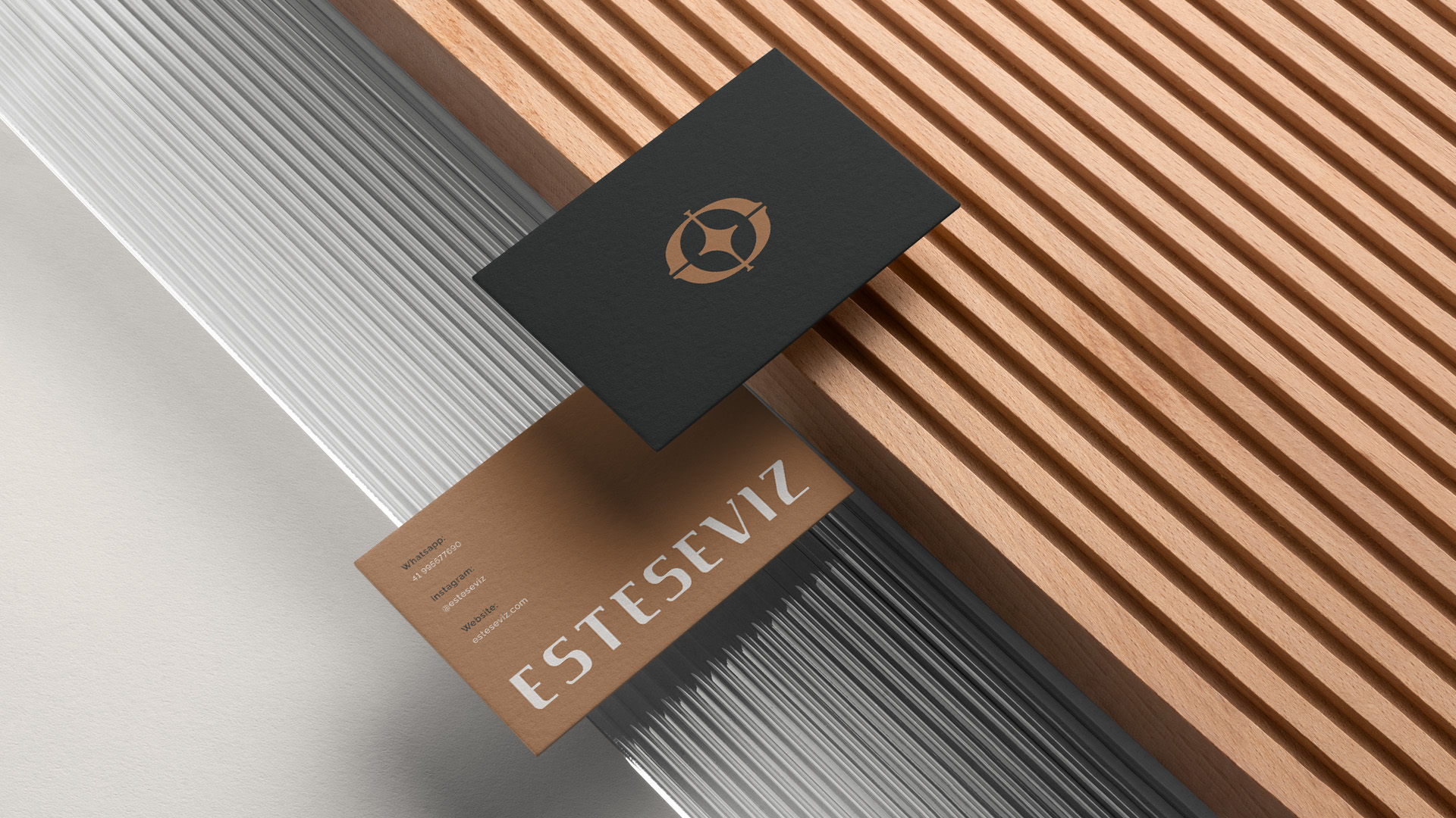
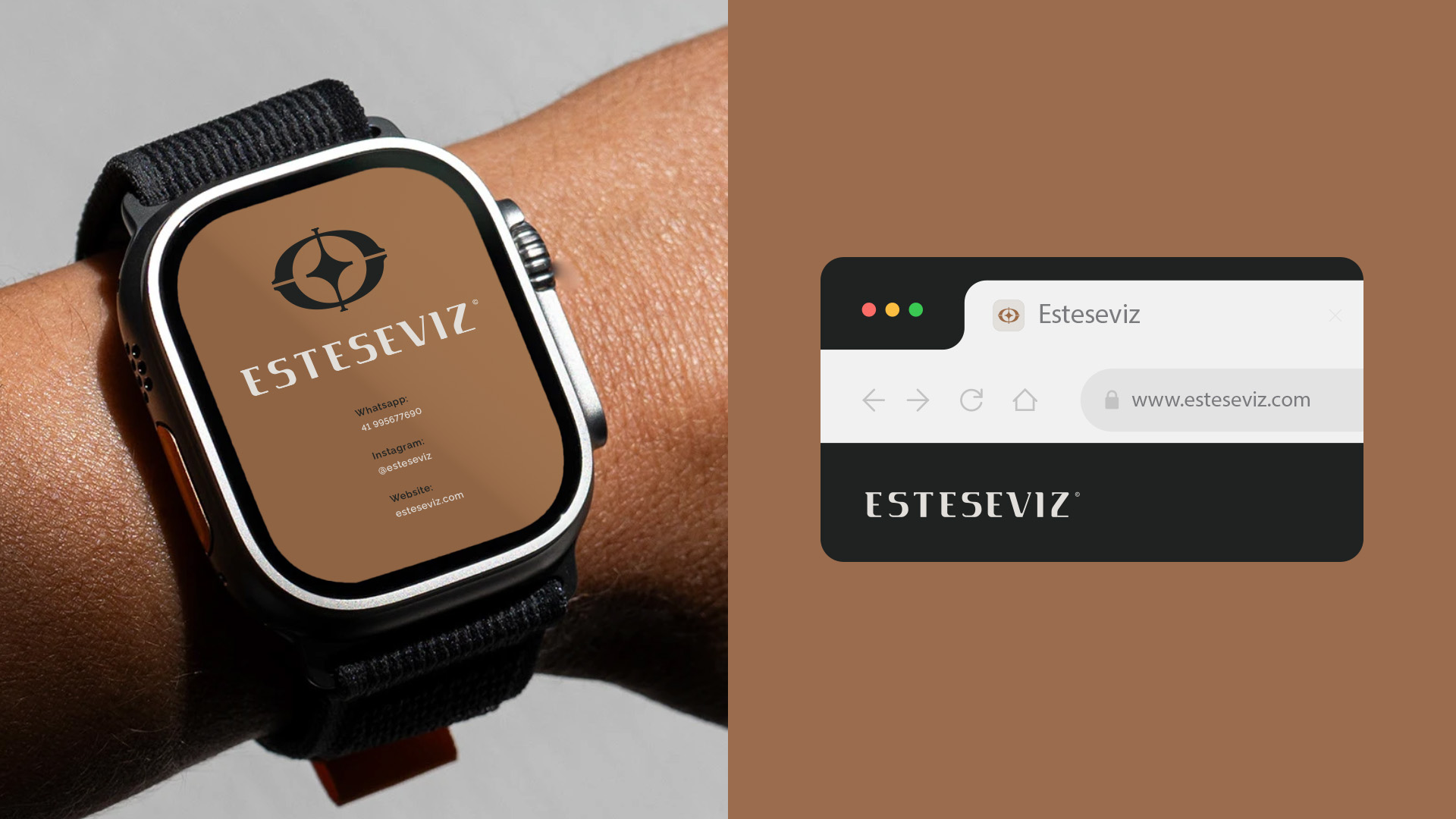
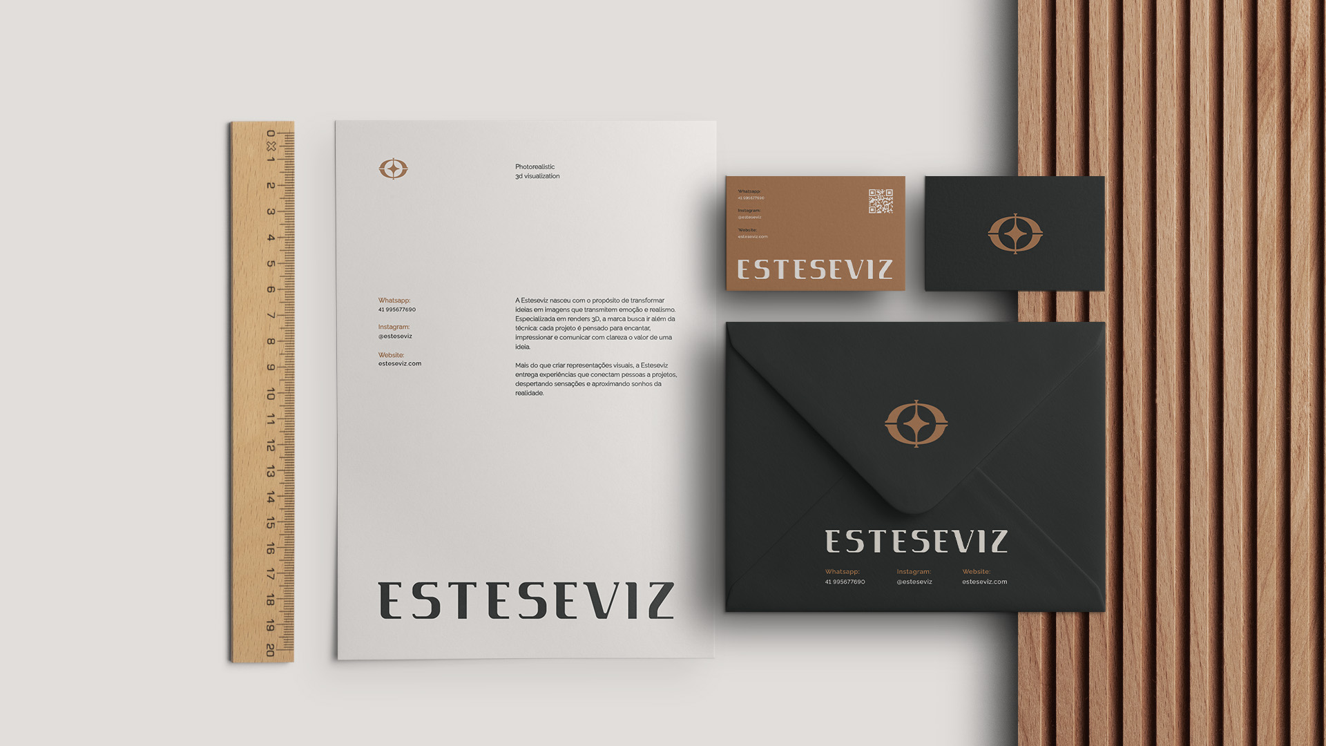
The symbol was developed from four elements that merge into a single icon, an eye, a star, the golden ratio (Φ) and Omega (Ω), where each one carries a concept of perception, balance, knowledge and elegance, together forming a visually unique identity that also pays homage to the client's admiration for Ancient Greece. The typography created from scratch with high contrast in the body and exclusive serifs complements the symbol and delivers the level of sophistication that a high-end audience demands.
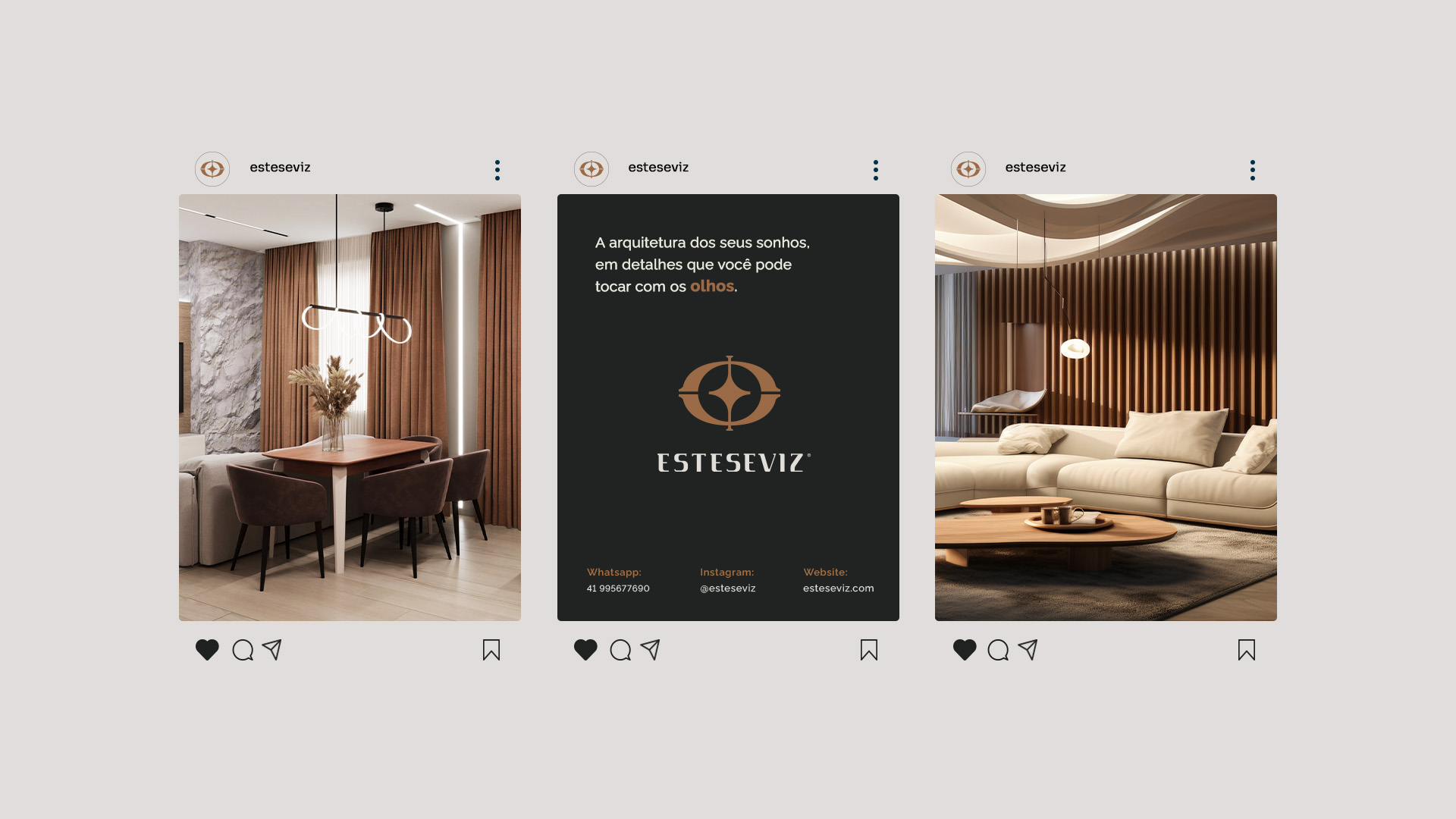
The impact of the new identity went beyond the market, as the founder herself began to see her work through new eyes and realized that what she delivers is far more valuable than she had imagined, and that conviction, now visible in the brand, was naturally passed on to her clients. The result was a solid positioning, a more confident communication and consistent growth built on a real foundation, the value the brand always had but that finally began to be seen.
CLIENT:
LORENA FONSECA
TIME:
5 WEEKS
SERVICES:
• VISUAL IDENTITY
• STATIONERY


COSCRATO DESIGN
© 2026 ALL RIGHTS RESERVED